Hide and show nav on scroll
This tutorial come once more after a question posted on facebook group Divi Theme Tutorials and relies on headroom.js library.
Maybe you didn’t noticed that the nav bar of my website is no more fixed.
If you scroll down the nav will hide, and will come back when you scroll up, so you are able to see the nav when you’re at the middle of the page just right after you start to scroll up.
How can we achieve this in DIVI ?
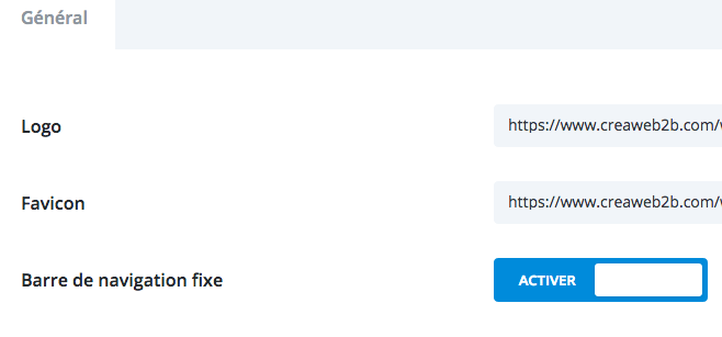
- First, we need to make sure navigation is set up to “fixed” inside DIVI theme options.Go to Divi options :

And activate fixed nav :
- Then, we need to add the headroom.js library to our child theme.
- Next, we need to add the init code to target the header
- We also need to add some css for slide – swing – flip – bounce animations
To make it easy, i packed all files you need inside an archive that you can download HERE.
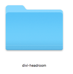
Once the archive divi-headroom.zip opened, you will have a folder called divi-headroom.
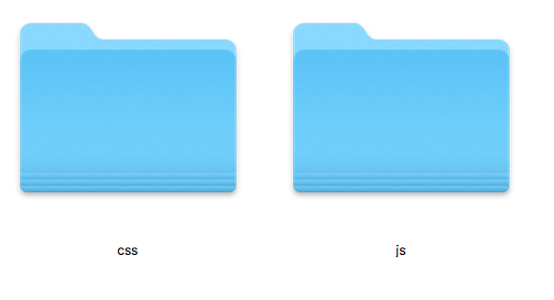
 Inside the folder you will find 2 folders : JS and CSS.

Copy the folders JS and CSS inside your child theme folder.
Now, you need to open your child theme functions.php with editor and replace the following code :
function my_enqueue_assets() {
    wp_enqueue_style( 'parent-style', get_template_directory_uri().'/style.css' );
}
add_action( 'wp_enqueue_scripts', 'my_enqueue_assets' );
with the following code to enqueue all our scripts (including DIVI theme style.css) :
function my_enqueue_assets() {
    wp_enqueue_style( 'parent-style', get_template_directory_uri().'/style.css' );
  wp_enqueue_style( 'headroom-style', get_stylesheet_directory_uri().'/css/headroom.css' );
    wp_enqueue_script( 'inithead.js', get_stylesheet_directory_uri().'/js/inithead.js','','',true);
    wp_enqueue_script( 'js-headroom', get_stylesheet_directory_uri().'/js/headroom-min.js','' ,'',true );
}
add_action( 'wp_enqueue_scripts', 'my_enqueue_assets' );
You’re almost done and you should already see your nav hide on scroll down and show again on scroll up. The next step is about customization of the offset and animation.
You can try different values live on headroom playroom live demo.
Once you have chosen the effect and offset you want, you’ll need to open the file inithead.js located inside your child theme folder –> JS folder and replace offset, tolerance, initial, pinned and unnpined values with the values of your choice.
Here are the different available animation classes :
Slide (default)
"pinned": "slideDown",
"unpinned": "slideUp"
Swing
"pinned": "swingInX",
"unpinned": "swingOutX"
Flip
"pinned": "flipInX",
"unpinned": "flipOutX"
Bounce
"pinned": "bounceInDown",
"unpinned": "bounceOutUp"
That’s all. Feel free to ask if you need help 🙂

Is there a chance to effect this only on mobile screens and not on desktop?
I’m sure it’s possible but never took time to test that.
Hi there, thanks a lot for a great job which is applicable by total newbe!
I have a one more question. On my page everything seems to be ok, apart menu’s visibility on top of the site. So it loads without menu, menu is invisible while scrolling down and shows while scrolling up. Until it reaches top fo the page, when it disappears again. Any ideas what did I make wrong? Thanks a lot!
Hi Armand, unless i see your exact code, it’s almost impossible for me to know what’s wrong. Feel free to contact me by email 🙂
Very good article. Thank you so much!
Fantastic tut, thank you!
Question if you have an answer – is there an ability to hide the menu on mobile until it starts scrolling?
In other words, keep the functionality you have but hide the menu on first load and display once scrolling begins?
Thank you in advance for any help but also for the stellar tutorial!
Thanks a lot for this tut! I was looking for this for a while!!!
thank you works very well!
Thanks for feedback:-)
I am on tablet at your website doesn’t seem to work. Is this for desktop only?
Sorry for the delay but i realize i never answered you. I apologize and here is the reason why it doesn’t work and the solution : when screen width is below 980px, position is switched from fixed to absolute and then the effect won’t apply. To make it work for screen < 980px, you need to add the following css : .et_fixed_nav #main-header {position:fixed!important;}
Amazing Tutorial!!! Thanks!!
Thanks for your feedback